

Vanguard Digital Advisor
We, the class of MEJO 581, were tasked by Steve Schang at Vanguard to redesign the Digital Advisor dashboard. This project started with a simple goal: see what could be changed, then explore those options.
My goal was to transform the existing dashboard into a more user-friendly experience that felt intuitive and purposeful. I wanted to make sure every page has a clear reason for being there, and information is presented in a way that makes sense.
But this redesign went beyond aesthetics (though a final design to be proud of was definitely a motivator!). The core purpose was to make managing the Vanguard portfolio easier for beginner investors. By simplifying the site and incorporating missing features, this project aimed to create a cohesive and user-friendly experience that gives users the information they need.
Dive deeper to see how we tackled the design challenge, conducted user research (from initial usability tests to high-fidelity mockups), and ultimately developed a solution that prioritizes both usability and an uplifting design aesthetic.
Usability Test
We started the project with a basic task: look at the current design and prototype and see what needs to be changed. We went through as individuals and took notes of the dashboard, but then got together as a group to do a few usability tests with people outside of the class and analyze the results.
Our biggest findings were:
- The visuals were highly praised
- There was an overwhelming amount of information presented
- The site used complicated jargon with too little definition of the terms
Our full presentation can be found here:
Personas
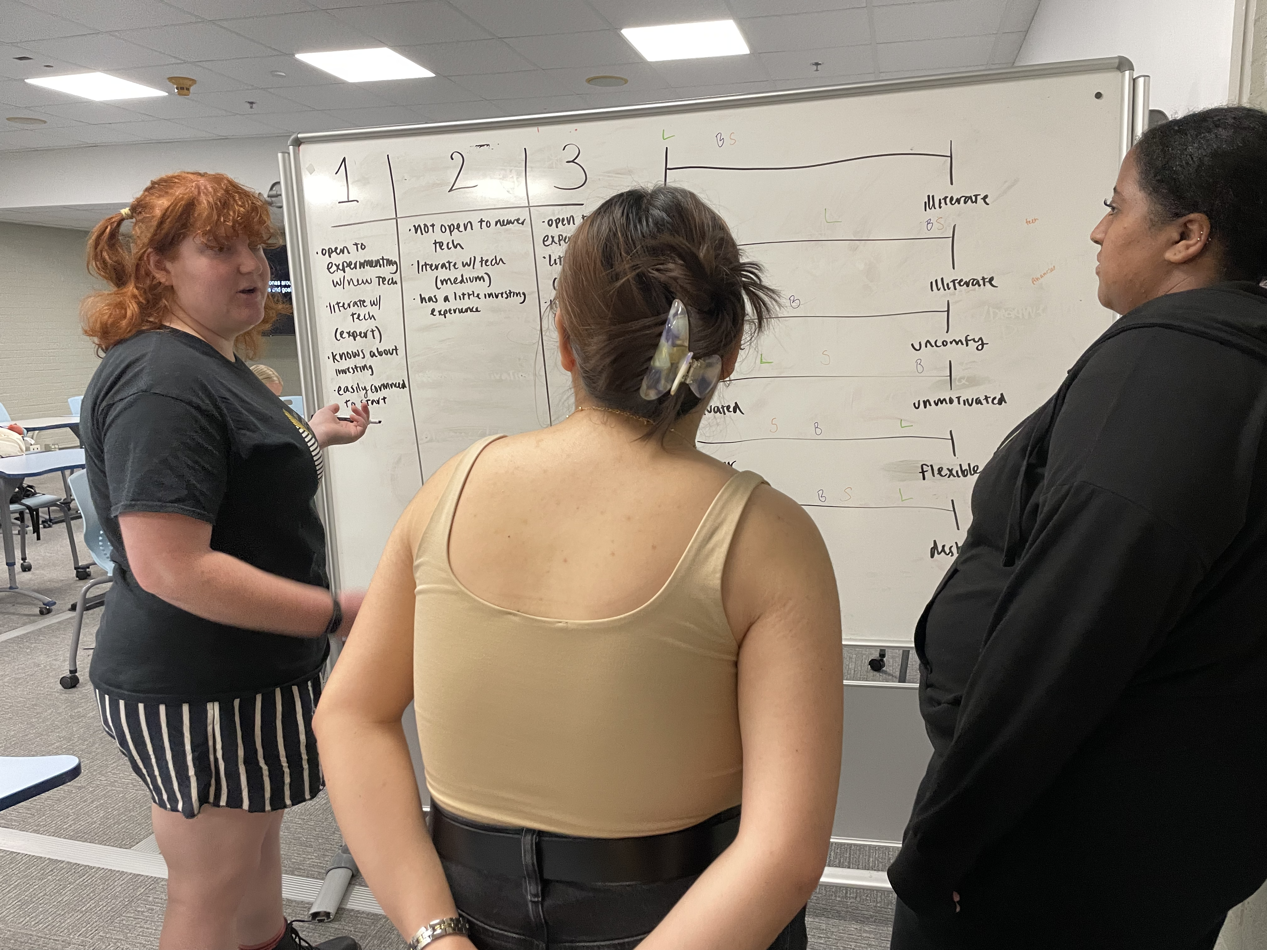
Once we presented our usability test findings to the class and Steve, we went into the next step: creating Personas. This was a two-step process.
First:
We conduct listening sessions with someone in the intended demographic.
From these, we learn more about our audience and gather information that will prove useful when it comes time to create personas to represent our audience. Our group conducted four listening sessions total, and developed four personas based on information we gathered from these interviewees.
Second:
We create our personas. My group was me, Delena Teklay, Giselle Zhu, and Hien Le.
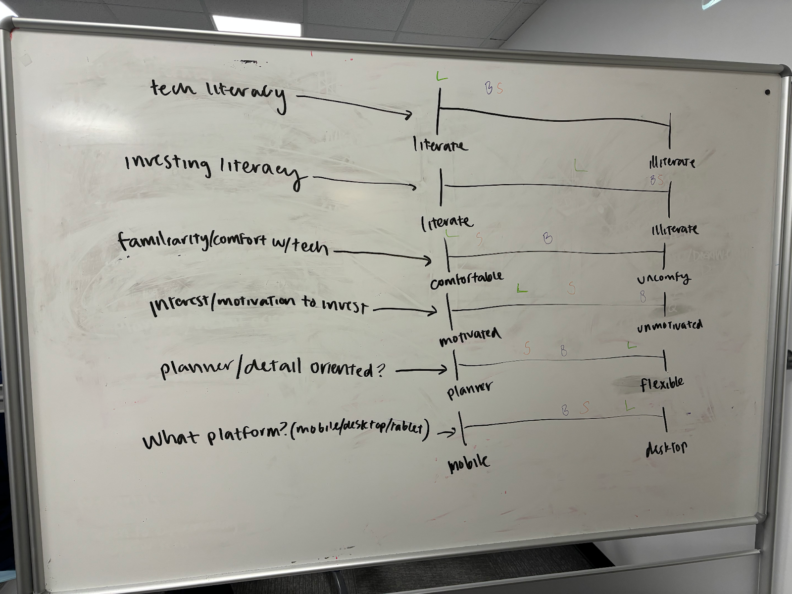
We created an Audience Analysis chart to put the interview results in one place.

“I still have this really negative connotation with [investing] where I think that I’d rather put my money someplace where the ups and downs are a little bit less volatile, even if that means that I’m missing out on potential big earnings or big savings.”
Participant B
Before we finalized these personas, we put them in an empathy map to help us better understand their thought processes.

After our interviews, we took to the whiteboards and mapped out our interviewee’s responses.
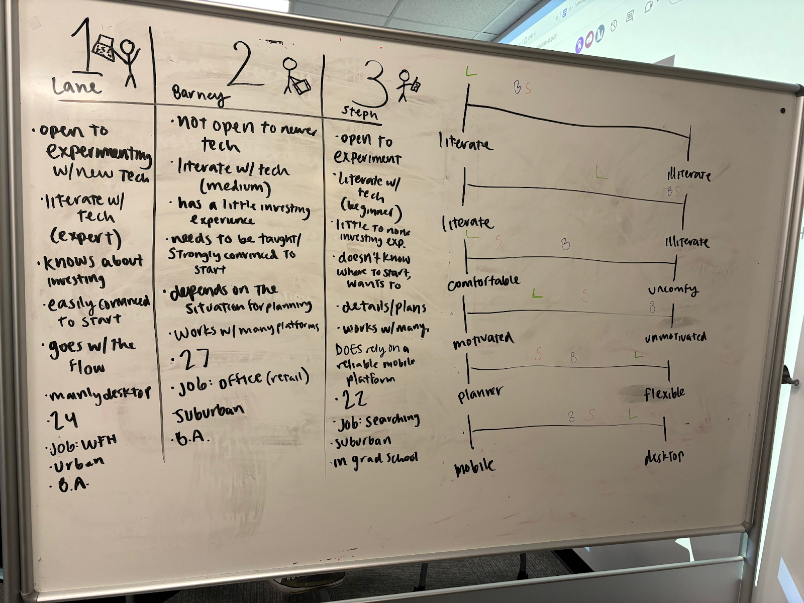
Final Persona examples:


Assets/Card Sort
After we created our personas, we then started working on the official redesign. This was broken up into a few steps.
First, we made an asset list, with the help of AI, to consider what Vanguard has and what they need. We were tasked to find 50-100 terms to then consolidate for the card sort.
After I consolidated the assets, I took my highlighted terms and put them into a test card sort at kardsort.com.
I decided to use a hybrid model of a sort, so my participants could add categories. Looking back, I would have preferred to see more people title categories of their own.

Card Sort Results
Below are a couple of the results from the sort. The spreadsheet with all the final responses is linked under that.


Structure/User flows
Once the card sorts were finished, we had to analyze them, organize them, then create user flows for our site.

I sorted my results like this. I put them into a Google doc, then organized them by section. The middle column was used for counting the frequency, to see the most agreed-upon category for each card. The highlighting was just to note which section each card belonged in.
My initial tree structure is below:
- Home
- Investing Tools
- Goal setting tools
- Digital advisor services/benefits
- Robo-Advisor Performance Explanation
- Human Advisor Integration
- Asset Location Strategies
- Risk tolerance assessment
- Tax-loss harvesting recommendations
- Fess/minimum investment requirements
- Paper trading simulator
- Help
- FAQ
- Articles and videos explaining investment basics
- Chatbot – Personalized Investment Education
- Portfolio
- Individual holding details
- Transaction history
- Total account value overview
- Investment Portfolio Analysis & Optimization
- Adjusting goals/contribution amounts
- Alerts for reaching price targets or exceeding risk tolerance levels
- External
- Stock screeners and market data news
- ESG Integration
- Investing Tools
After everything was organized, we created user flows, to simulate a person’s path through our website. Here are mine:
Wireframes
Once we finished with our user flows, it was time to get into actually creating the website. This means it’s time for wireframe, low-fidelity mockups.
Here are some of my initial sketches for the assignment:


These initial sketches then turned into this wireframe prototype:
Here’s a link to the full file, so you can see the interactivity and design elements.
User testing
To user test, I had to first create a working high-fidelity mockup (there is an embedded version below in the “Final High-Fidelity Mockup” section, just below this). To go with that, I also created a style guide, of sorts. This kit helped guide me toward colors, the font choices, and was a central guide for a couple of elements in the final mockups.
Once I made a working model that was finalized enough to share, I put it out onto UserTesting.com, for the public to take some tests. I opened it up to three options, and got good feedback from each tester. After the initial test, I implemented some of their feedback, then sent out the edited prototype for a second test. The new feedback didn’t mention the fixes I made, so I knew I was on the right track.
A lot of their feedback included factors that I, a college student who does not primarily focus on economics, am also not an expert on. For example, I did not elaborate on the “Investing Tools” page or “The Market,” mostly because I personally don’t know everything about them. Luckily, this redesign is just the first of what would be many, and those two tabs are simply roadmaps for what those pages could be. Lots of user feedback surrounding these pages, however, asked for more description or personal help options.
One recurring point that users made was their desire to have direct contact with a representative from Vanguard, rather than just a Chatbot or Contact form. If I were to make more major edits, I would edit the Chatbot page to include a “Speak with a real person” option, but that is not necessarily a fix I consider myself allowed to make.
The two almost unanimous positive responses to the prototype were the goal creation sections and the “Help” tab. People liked the customizable and friendly nature of the goals, and they thought the “Help” page had enough information for anybody who was looking for it.
Here are the full results of both tests, including transcripts from everyone:
Test one: https://docs.google.com/spreadsheets/d/1QBsB5zD9VfLcp0BbjCsACQrNF3OkL3Gkwab7POK7DO4/edit?usp=sharing
Test two: https://docs.google.com/spreadsheets/d/1TE7bdtasXPy28texUDI6Is32BYrd8-_g1s3BCxi9NJk/edit?usp=sharing
High Fidelity Mockup
Finally, after a long process, these high-fidelity pages are able to be shared. I’ve implemented as much user feedback as possible, but keep in mind that a) this was my first time using Figma for a full-scale project like this, and b) it is a limited prototype. Some examples of feedback I implemented was moving the search icon down so it’s next to the alerts icon, rather than at the top of the page. I also added a little “See more…” button at the bottom of the help page, which would (in theory) link to Vanguard’s trove of articles and videos. I also added a little help button to “The Market,” to offer a place to get more advice.
This project was such a helpful way to teach me about the UX design process – rethinking the dashboard, testing ideas, and seeing it all come together. I hope my work was helpful to Steve and the rest of the Vanguard team, and I’m excited to keep learning and using this approach to create even better interfaces in the future.